
greenswriting
  • Home
  • Business
  • Featured
  • Global Trade
  • Industry
  • LifeHot
  • Market
  • Tech
  • Travel
Author

Raymond

Raymond

Market

Human-Centered Visual Navigation: How Smart Spatial Wayfinding Transforms High-Traffic Digital Signage

by Raymond July 1, 2026

Putting the traveler first

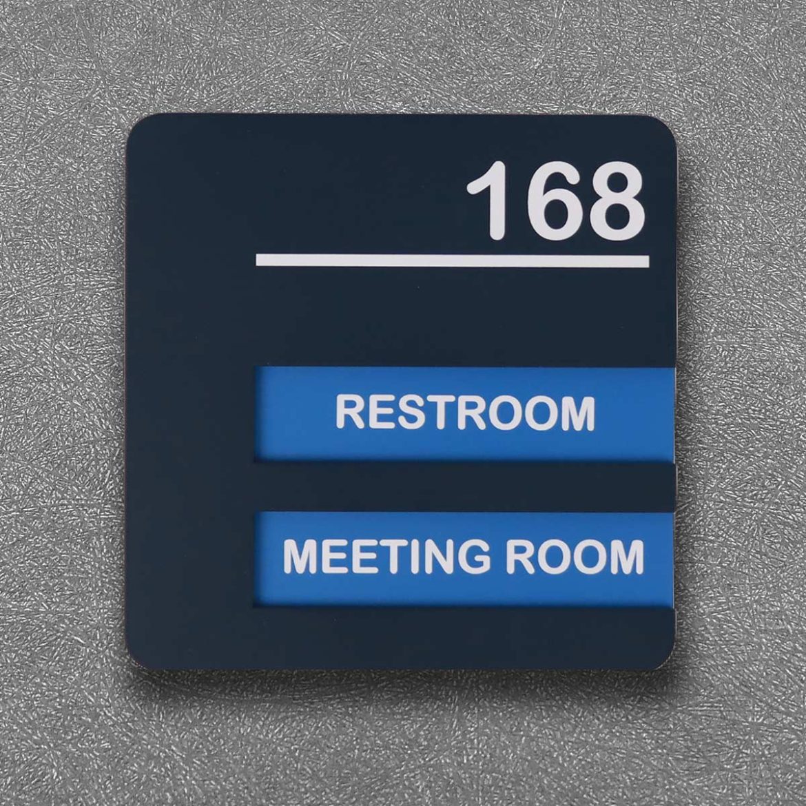
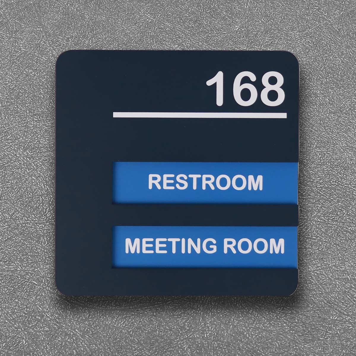
People move fast. They need clear cues, not clever puzzles. A user-centric wayfinding approach changes signs from passive labels into active helpers that reduce stress and speed movement. Good implementations of public transport signage treat every display as part of a coordinated system that anticipates decisions, highlights sightlines, and minimizes cognitive load.

public transport signage

The user experience anatomy

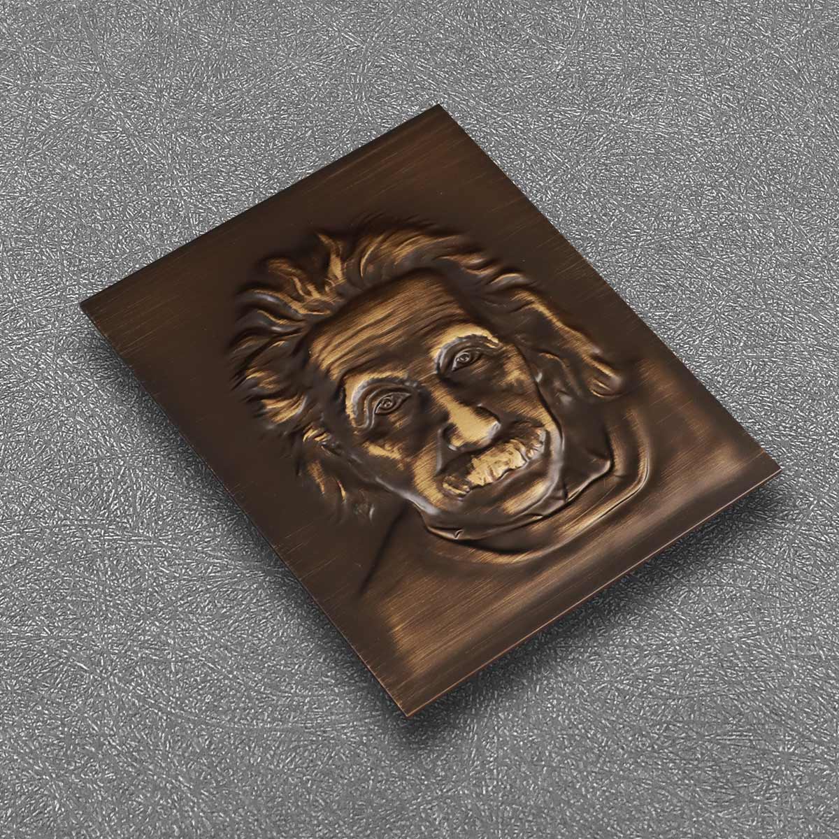
Start with the human body and how it reads the world: field of view, glance time, and decision moments. Effective digital signage considers legibility at distance, contrast in different light, and the typical pedestrian flow in a terminal. At major hubs like London’s Victoria Coach Station, clear layouts and signage guide thousands daily and keep boarding moving. This is practical ergonomics—wayfinding that respects real human limits and behaviors.

Design principles that actually work

Keep the rules tight and visible. A few principles cut most confusion: a clear signage hierarchy, concise copy, high-contrast typography, and placement aligned with natural sightlines. Use icons sparingly and consistently; icons speed recognition when they’re trained into the environment. Digital panels should prioritize current context—next departures, platform numbers, and immediate actions—so users don’t hunt for relevance. These moves lower dwell time and smooth pedestrian flow.

Common mistakes operators keep repeating

Overloading screens with full schedules, tiny fonts, or decorative flourishes defeats the point. Too many menu layers create blind spots — people skip steps. Another trap is inconsistent language across zones; mismatched symbols or conflicting colors break trust. Fixing these requires a checklist-based audit: sightline tests, contrast checks, and a short-user test with real travelers — quick, revealing, and inexpensive.

public transport signage

Tech choices that support users

Select hardware and software for reliability and clarity. High-brightness displays, fast refresh rates, and simple content management systems reduce glitches that frustrate commuters. Integrate real-time feeds without clutter: highlight changes, don’t bury them. Consider accessibility features like larger fonts and audio prompts for blind or low-vision travelers—small additions that widen usability dramatically.

Measuring what matters

Track outcomes tied to behavior: reduced boarding times, fewer missed connections, and lower info-desk loads. Use brief observational studies and sensor data to measure pedestrian flow and how often people stop or backtrack. Combine those with user surveys for sentiment. When data points agree—shorter dwell time and higher satisfaction—you’ve got a clear win for the design. —This mix of metrics keeps conversations practical and grounded.

How bus terminal signage fits into the bigger picture

Bus terminal signage acts as the local translator between system data and human action. Well-designed terminals sync digital displays with physical signs, maps, and staff cues. That synchronization reduces confusion at transfer points and helps maintain schedule reliability. For operators, this means fewer delays and a better reputation among riders.

Advisory: three golden rules for choosing the right approach

1) Prioritize legibility and placement: test text at real distances and angles before installation. 2) Measure behavior, not just appearance: use simple flow metrics (boarding time, stop-and-backtrack rate, help-desk queries). 3) Build consistency into the system: one visual language across digital panels, static signs, and employee uniforms. Follow those three and the system becomes predictable for users and cheaper to maintain.

Good wayfinding is a human solution to a human problem—solid research, fast hardware, and clear rules make busy terminals calmer and faster. The payoff is tangible: quicker turns, fewer complaints, and a better daily experience for riders and staff alike. Cosun Sign has practical products and design thinking that slot neatly into this approach—smart, readable, and built for real-world use. —Joyful clarity wins every time.
July 1, 2026 0 comments
0 FacebookTwitterPinterestEmail
Global Trade

The Comparative Choice: Recyclable Alloys Versus Conventional Materials for Commercial Office Signage

by Raymond May 24, 2026

Comparative overview and practical stakes

When specifying signage for commercial office buildings, project teams must compare recyclable alloys finished with eco-friendly powder coating against conventional substrates such as acrylic, PVC, or anodised aluminium. The decision is not only aesthetic; it intersects with tactile requirements, durability and regulatory compliance—particularly for ada braille signs where legibility and tactile contrast are mandatory. Globally recognised standards, notably the Americans with Disabilities Act (ADA, 1990), and broad disability prevalence estimates from the World Health Organization (approximately 15% of the global population) provide a real-world anchor for why tactile wayfinding and braille functionality matter in commercial projects.

ada braille signs

Material performance and tactile requirements

Recyclable alloys typically offer higher structural rigidity and better edge definition for raised characters and braille than many plastics. For signage that must accommodate raised characters and tactile signage, metals yield crisp, durable tactile profiles that withstand repeated touch without deformation. By contrast, acrylic can chip and PVC can creep under load; both risk losing tactile clarity over time. Where ADA-compliance is involved, the substrate’s ability to hold precise braille dots and maintain contrast is a primary technical requirement—this frames the comparative advantage of alloys for long-term wayfinding integrity. Integrating ada room signs into a unified system benefits from a material palette that supports both visual consistency and tactile performance.

ada braille signs

Finish technologies: eco-friendly powder coating versus alternatives

Eco-friendly powder coatings now match or exceed liquid paints in colour stability and abrasion resistance, while avoiding volatile organic compounds (VOCs) associated with solvent-based finishes. Powder coating on recyclable alloys creates a durable surface that preserves tactile contrast and reduces maintenance cycles. Anodising remains a useful alternative when metallic finish and thin coating profiles are essential, but it offers limited colour options and is less reparable than powder-coated surfaces. Lifecycle thinking favours recyclable alloys with low-impact powder coatings when the objective includes reduced waste at end-of-life and lower ongoing maintenance costs—factors that matter in large office complexes where signage is numerous and exposed to daily interaction.

Cost, lifecycle and procurement considerations

Upfront material cost for recyclable alloys can exceed that of basic acrylic or PVC, but lifecycle costs often reverse the calculation: fewer replacements, lesser cleaning intensity, and longer periods between refurbishments. Procurement teams must quantify total cost of ownership over 5–10 years, including replacement, labour for maintenance, and the environmental benefit of recycling at end-of-life. Specification errors typically arise from underestimating tactile wear or selecting finishes that mask contrast under office lighting — a practical oversight that leads to early retrofits. — A modest change in testing protocol during design review prevents such rework.

Common specification mistakes and viable alternatives

Frequent mistakes include: specifying thin-gauge metals that deform under touch, choosing powder colours that reduce tactile contrast, and omitting accessible mounting heights that align with wayfinding standards. Alternatives that merit consideration are composite panels with metal face sheets for reduced weight, and high-performance thermoplastics engineered for tactile retention. Each alternative should be evaluated against the project’s accessibility obligations, maintenance capacity, and end-of-life recycling pathways.

Three golden rules for selection

1) Prioritise tactile fidelity: select substrates and finishes that retain raised characters and braille after repeated contact. Measure by sample wear tests and tactile-read trials. 2) Evaluate total lifecycle cost: include manufacture, maintenance intervals, replacement probability, and recyclability at disposal. Use a 5–10 year horizon. 3) Confirm regulatory and human factors alignment: verify ADA-compliance and conduct user-readability checks under site lighting and typical touch scenarios.

These metrics steer decisions toward durable, accessible, and environmentally responsible solutions; they also explain why many architects and facilities managers consult Cosun Sign when finalising technical specifications for wayfinding and room identification — an integration of craft and data that produces reliable signage for people and places. —

May 24, 2026 0 comments
0 FacebookTwitterPinterestEmail
Tech

The Rise of Artificial Flower Manufacturing: Trends and Future Perspectives

by Raymond April 17, 2026

Engaging the Senses: A Quick Dive into the Market

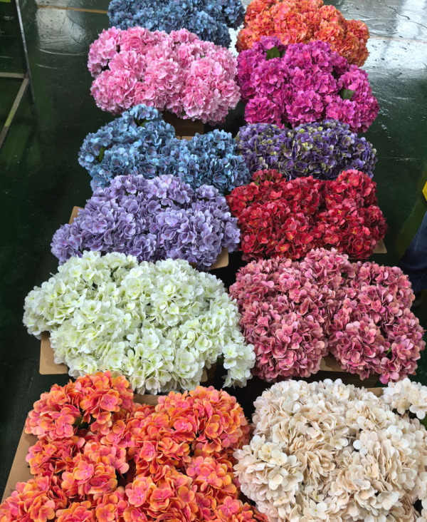
I vividly recall walking through a bustling trade fair, surrounded by vibrant displays of artificial flowers that seemed almost lifelike. With the artificial flower market projected to grow significantly, it’s no wonder buyers are seeking a reliable artificial flower manufacturer in china for their needs. Each bloom, crafted with intricate detail, raises an important question: how do manufacturers keep pace with the evolving demands of consumers?”

artificial flower manufacturer

The Mechanical Flaws in Traditional Approaches

Manufacturers often face obstacles that affect the perception of artificial flowers. For instance, many traditional methods rely on outdated techniques that don’t prioritize sustainable materials, causing consumers to hesitate. As a seasoned retailer, I’ve witnessed firsthand how a lack of innovation can lead to products that lack durability, resulting in wasted resources (which isn’t ideal!). The industry’s pressing need for eco-friendly options is becoming undeniable.

artificial flower manufacturer

Why Quality Matters

When I speak with wholesale buyers, they often cite quality as a major concern. Cheap materials lead to fading colors and breakage. An effective artificial flower manufacturer must find a balance between cost and quality, to truly satisfy the end consumer. Being aware of these aspects will give buyers a competitive edge; after all, who wants to sell flowers that wilt at first glance?

Paving the Path Forward: Innovations on the Horizon

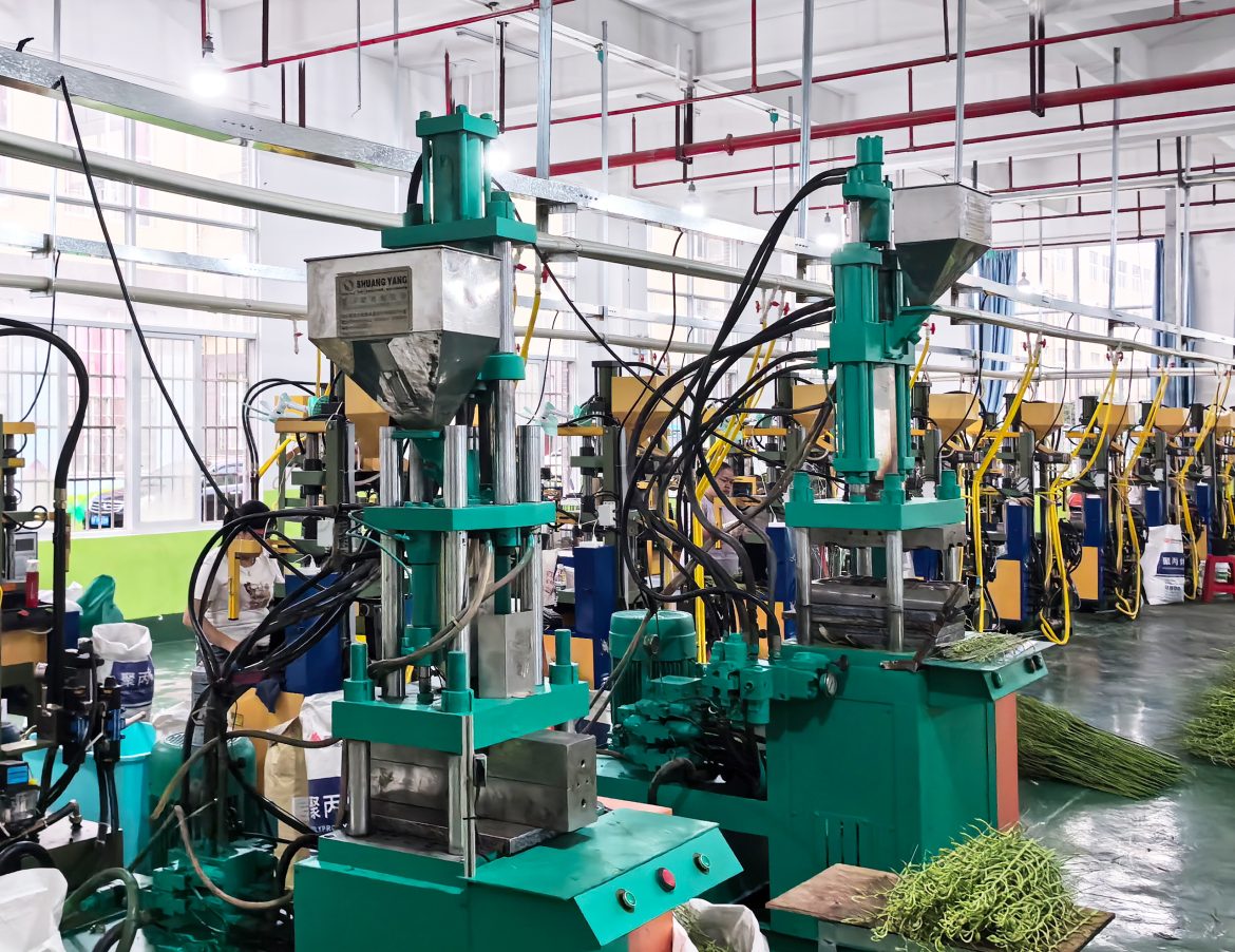
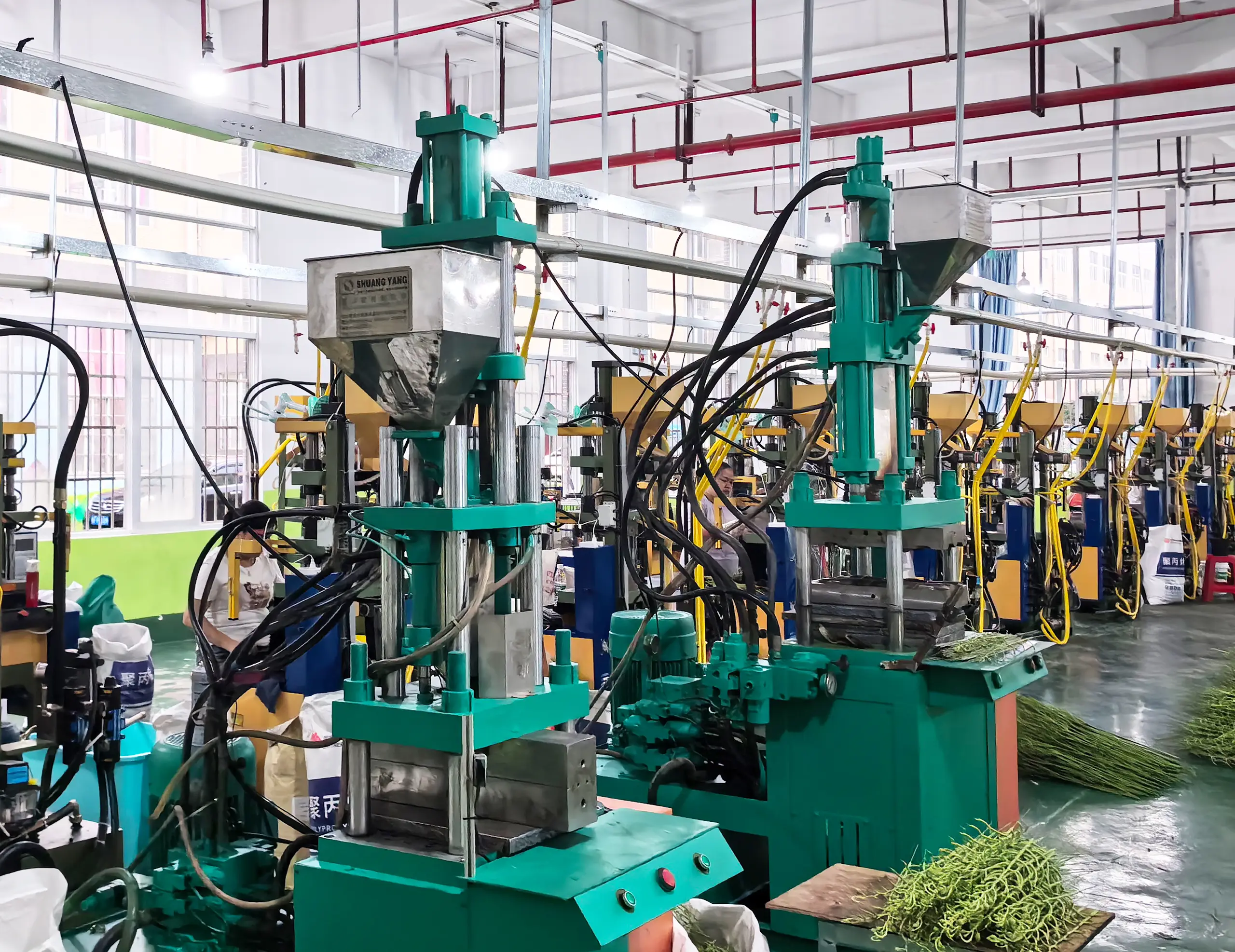
Looking ahead, the role of technology in artificial flower manufacturing cannot be overstated, particularly for the artificial flower manufacturer in china. Cutting-edge production techniques such as 3D printing are gaining traction. This not only enhances customization but significantly reduces waste in the production process. I firmly believe that manufacturers who embrace these innovations will carve out a sturdy lead in this transformative market.

What’s Next for Sustainability?

As the demand for sustainability grows, choosing a manufacturer that prioritizes eco-friendly practices is essential. In 2022, I partnered with a manufacturer that utilizes recycled plastics, and the response was overwhelmingly positive. Buyers appreciated the effort, signaling a strong shift towards sustainable practices in our industry. As I look to the future, I see an exciting landscape where traditional aesthetics meet modern values, assuring that we remain relevant.

The Final Thoughts: Embracing Change for Future Success

To summarize, it’s clear that the evolution of artificial flower manufacturing is driven by technology and consumer preferences. Moving forward, carefully evaluating manufacturers based on the quality, sustainability, and innovative methods they offer will ultimately lead to smarter purchasing decisions. We’ve learned that it’s no longer just about aesthetics; function and ethical practices must align. In navigating these changes, never underestimate the power of a brand that truly understands its consumers.

In the world of artificial flowers, becoming a trusted partner means evolving with the market. There’s much to be gained from aligning with manufacturers who implement these practices, like TrustFloral, which exemplifies what the future of artificial flower manufacturing can be. The blooms may not wilt, but our responsibility to innovate must always flourish.

April 17, 2026 0 comments
0 FacebookTwitterPinterestEmail

Recent Posts

  • Side-by-Side: When Floor Robots Outpace Mops — A Practical Comparison for Industrial Spaces
  • How to Tailor Stainless Steel Kitchen Cabinets to Fit Your Interior Dreams
  • Future-Forward Forms: How Empty Perfume Bottles Will Shape Personal Scent in 2026
  • Choosing the Right Metabolic Model: A Comparative View for Reliable Preclinical Outcomes
  • Calibrating Micro-Pore Density Against Thermal Conductivity: A Data-Driven Playbook for Thermal Clothing

Recent Comments

  1. Penci on Get Lost in the LA
  2. Penci on Weekend Coffee & Music
  3. Penci on Amazing Nature of Ireland
  4. Penci on Story of a Traveler
  5. Penci on Freedom under the Sun

About Me

About Me

Writer & Reader

Neque porro quisquam est, qui dolorem ipsum quia dolor sit amet, consectetur, adipisci velit, sed.

Keep in touch

Facebook Twitter Instagram Pinterest Tumblr Youtube Bloglovin Snapchat

Recent Posts

  • Side-by-Side: When Floor Robots Outpace Mops — A Practical Comparison for Industrial Spaces

    July 18, 2026
  • How to Tailor Stainless Steel Kitchen Cabinets to Fit Your Interior Dreams

    July 18, 2026
  • Future-Forward Forms: How Empty Perfume Bottles Will Shape Personal Scent in 2026

    July 18, 2026
  • Choosing the Right Metabolic Model: A Comparative View for Reliable Preclinical Outcomes

    July 17, 2026
  • Calibrating Micro-Pore Density Against Thermal Conductivity: A Data-Driven Playbook for Thermal Clothing

    July 15, 2026

Categories

  • Business (119)
  • Featured (6)
  • Global Trade (121)
  • Industry (92)
  • Life (2)
  • Market (123)
  • Moments (7)
  • Nature (5)
  • Stories (6)
  • Tech (131)
  • Travel (5)

About me

banner
Soledad is the best selling Blog & Magazine WordPress Theme of this year on Themeforest.

Popular Posts

  • 1

    My Baby Cactus

    June 7, 2017
  • 2

    Writing New Life Chapter

    June 7, 2017
  • 3

    Green Corner in My Home

    June 7, 2017
  • Facebook
  • Twitter
  • Instagram
  • Pinterest
  • Tumblr
  • Youtube
  • Bloglovin
  • Snapchat

@2019 - All Right Reserved. Designed and Developed by PenciDesign


Back To Top
greenswriting
  • Home
  • Business
  • Featured
  • Global Trade
  • Industry
  • LifeHot
  • Market
  • Tech
  • Travel